

What is Relative Length Units?
Relative length units are relative to something else, the size of the parent element's font, or the size of the viewport.
They scale relative to a parent or the viewport, and style sheets written with relative units can more easily scale from one environment to another, like from a desktop to a mobile screen.
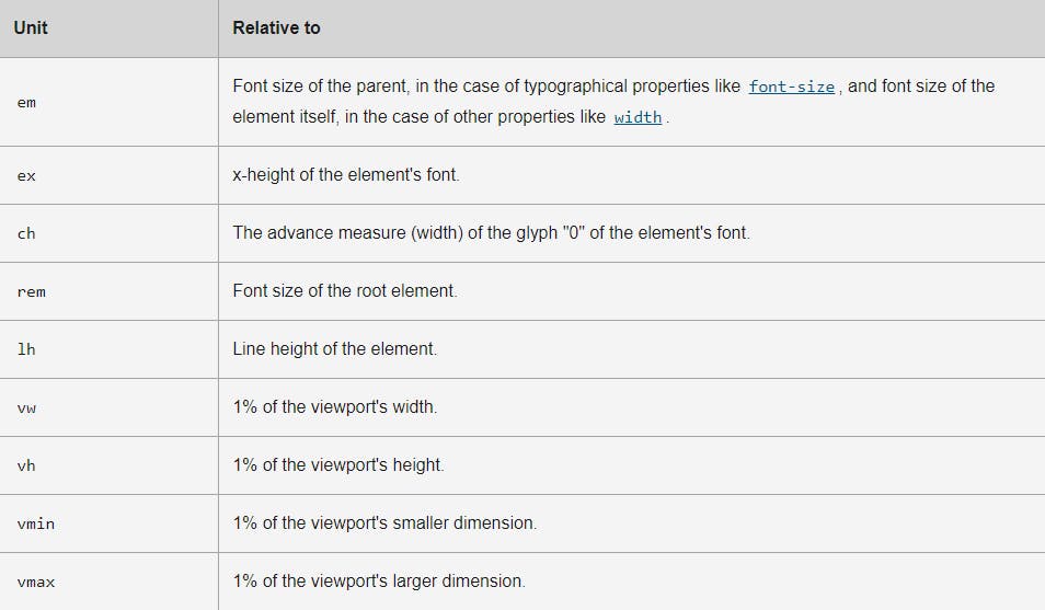
Here is a summary table of the relative units by Mozilla developer:
 By looing at the above table, now let's take a deep dive inside :
em
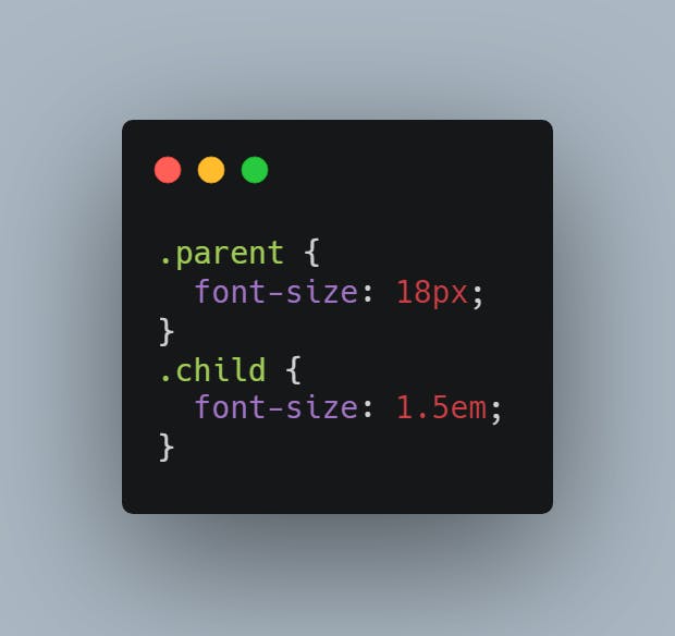
The em unit is relative to the current font size of the element. em and rem units are practical for establishing scalable and flexible layouts. When a user resizes their text or changes the font size in the stylesheets, the em unit will scale proportionally.
Example: Here want the font size of a child element to be 1.5em of the parent element. If the font size of the parent is 18px, the child will become 27px (1.5 x18)=27px.
ex
The ex unit is relative to the x-height of the font. It is rarely used, but is much the same as the ch unit, just for height instead.
Generally, this unit is not often used in CSS.
ch
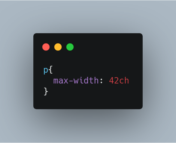
The ch unit is relative to the width of the number “0”. Using the ch unit, we can determine how many characters, e.g., a paragraph, should have on each line.
Example: A certain text has a paragraph with 42 characters, we can use the ch to set 42 characters per line for best readability.
rem
The rem unit is the root em. It is relative to the default font-size of the root element of the HTML document.
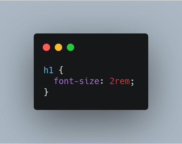
Example: In a case where we would like that all h1 elements to be twice the size. Instead of defining 30px to a h1 element (which is first of all fixed and will not make it relative to other than itself), we can use rem :
Viewport
Viewport length units is much more easier to use compared to percentages, since viewport is defined with the browser's window size . There are two types viewport width (vw) and viewport height (vh).
vw
The vw unit is the relative unit which is 1% of the width of the viewport and the viewport is the size of the browser window. It differs from browsers to browsers.
In simple terms, it is 1/100th of the width of the viewport.
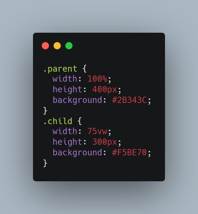
Example: We want a left-positioned child div that takes up 75%width of a parent div, based on the width of the viewport.
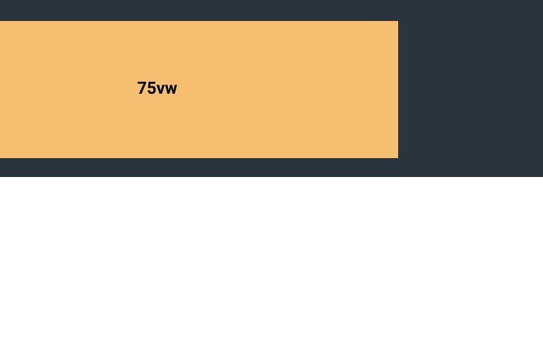
Here is how the output looks like:
vh
The vh unit is the relative unit which is 1% of the height of the viewport (size of the browser window).
In simple terms, it is 1/100th of the height of the viewport.
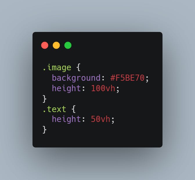
Example: We have a landing page where we want an image placed at the very top. The image should take up the entire screen height — like a full-screen section feeling — and when we scroll, the rest of the content will show up. The content below could take up half the viewport height:
vmin & vmax
vmin is a relative length which will be the minimum of vw & vh so it will be 1% of the width of the viewport (vw) if vw is smaller than vh else it will be 1% of the height of the viewport (vh).
Similarly, the vmax is a relative length which will be the maximum of vw & vh so it will be 1% of the width of the viewport (vw) if vw is larger than vh else it will be 1% of the height of the viewport (vh).
Note: In typography vmax && vmin length units are useful when sizing the text

Using relative CSS units is good when developing dynamic websites that should be used for multiple device resolutions and focusing on accessibility and for the best user experience.
Thanks for reading !